Grape Berry Development
Jordan Koutroumanidis of Wintitles managed to portray the entire lifecycle of a grape berry in one chart. It conveys a wealth of information, but will take a couple of minutes to fully comprehend. It is an illustration accompanying an article titled: “Understanding Grape Berry Development” by James Kennedy, Department of Food Science & Technology, Oregon State University, Corvallis, Oregon. It was published in Practical Winery in 2002.
The full article can be found here.
Here is my synopsis and legend for the chart:
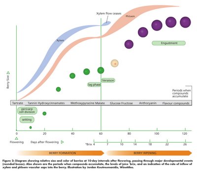
- The vertical axis shows the increase in grape berry size.
- The horizontal axis shows the number of elapsed days starting with grape flowering.
- The small green circles, changing to medium green circles and then larger purple circles portray relative berry size and color development.
- The blue band labeled Xylem shows the primary growth mechanism during the first period of growth – where water and nutrients are transported into the berry from the root system.
- The salmon colored band labeled Phloem regulates growth and maturity once the xylem phase is reduced. After veraison, the plant shifts from transporting root system nutrients into the berries (Xylem), to transporting sucrose from the canopy into the berries (Phloem).
- The green text bubbles indicate major developmental events, like engustment.
- The grey bar with black text lists periods when compounds accumulate that influence wine quality (tartrate, malic acid, anthocyanins, etc.).
- Lastly, a second horizontal scale shows approximate sugar content as measured by degrees Brix.
posted by SeufertWinery at
3:28 PM
![]()

0 Comments:
Post a Comment
<< Home